
If your emails look “fine,” that’s the problem. In email marketing, “fine” is the polite cousin of “forgettable.” And forgettable emails don’t get clicks, sales, or anything but an unsubscribe. Your design is either making you money or quietly costing you every time you hit send.
The worst part? You probably know exactly what I’m talking about. The stock template, the blurry product image, the button that somehow blends into the background. Meanwhile, your competitors are sending polished, mobile-perfect emails that make your customers wonder why they ever signed up for yours.
The difference comes down to design that is built to convert, and the rest of this guide will show you exactly why it matters.
Let's get into it.
The Expensive Truth About Cheap Email Design
Let's be honest about what's happening in your inbox right now. You can spot amateur email design from a mile away. It's the design that screams "I downloaded this for free," the images that don't load properly on mobile, the call-to-action buttons you have to squint to see.
Here's what most businesses don't realize: email marketing delivers $36-42 for every dollar spent, but only when it's done right. The problem is that 40% of marketers say designing emails is their biggest challenge, so they take shortcuts with generic designs that end up costing them serious money.
The data doesn't lie. Professional email design isn't just about looking good, though it often does. When done correctly, businesses see dramatic improvements. One documented case study showed a 289% increase in click-through rates simply by implementing professional design principles that prioritized conversion over pure aesthetics.
Why DIY Klaviyo Email Design Costs You Money
The Mobile Disaster
Half of your subscribers will delete your email immediately if it doesn't work properly on their phone. That's not an exaggeration. Mobile optimization isn't optional anymore, but most DIY email designs handle it poorly. Professional design ensures your emails look perfect whether someone opens them on an iPhone, Android, or ancient tablet.
Visual Chaos That Kills Conversions
Some emails seem to throw everything at the wall and hope something sticks. The most common design problems include:
- Too many competing fonts that create visual noise
- Clashing colors that hurt readability
- Call-to-action buttons that disappear into the background
- No clear visual hierarchy guiding the reader's eye
A well-crafted design guides the viewer’s eye in a deliberate order, leading them through each step of the conversion journey. Every element is placed with intention and serves a clear purpose.
Brand Confusion
Generic designs make your emails look like everyone else's. Your customers should recognize your email as yours before they even see the sender name.
This requires:
- Consistent color palettes that match your website
- Typography choices that reflect your brand personality
- Layout patterns that feel familiar to your audience
- Visual elements that reinforce brand recognition
Most businesses think they can slap their logo on an email and call it branded. That's like putting a designer label on a knock-off handbag. People notice the difference immediately.
Technical Failures You Don't See
Email clients are notoriously finicky. What looks perfect in Gmail might break completely in Outlook. Professional designers know these quirks and design around them. They understand deliverability factors that can send your emails straight to spam folders before your subscribers even have a chance to ignore them.
What Professional Klaviyo Email Design Delivers
Professional email design isn't about making emails that win awards. It's about creating systematic improvements that compound into serious revenue growth.
Design that Drives Action
Understanding how the brain processes visual cues is key to effective email design. Red can spark urgency for limited-time offers, blue can build trust in welcome sequences, and white space can reduce overwhelm while improving focus. Strategic placement directs attention exactly where it’s needed, with every choice grounded in behavioral psychology rather than personal preference or passing trends.
Technical Excellence That Works Everywhere
Effective email design ensures your messages display flawlessly across all devices and email clients. Key factors include:
- Images that load quickly on slow connections
- CTAs that are finger-friendly on mobile screens
- Design that gracefully degrades in older email clients
This technical foundation is invisible to recipients but crucial for performance.
Klaviyo Email Design Integration Mastery
Email designers use Klaviyo’s advanced features to create visually compelling campaigns that also perform. Dynamic content blocks adapt to each recipient based on browsing behavior, templates are crafted to work seamlessly across every flow type, and layouts are designed to respond beautifully to behavioral triggers and customer data. Every element is built to look great, load quickly, and guide the reader toward action.
This isn't about using every feature available. It's about using the right features in the right way to drive results.
Email Design Performance Data: Professional vs Amateur
The difference between amateur and professional email design shows up immediately in your metrics. Abandoned cart emails with professional design earn an average of $3.45 per recipient, while poorly designed emails struggle to break even on their sending costs.
Segmentation Success
Segmentation can turn good email marketing into great, but only if the design adapts effortlessly to each audience. Segmented campaigns drive 30% more opens and 50% more clicks than generic blasts, but that advantage only holds when each variation looks cohesive and purposeful. Change the offer, swap the headline, update the visuals — the design should handle it all without losing its polish.
Mobile Responsiveness Impact
When businesses finally fix their mobile email experience, they typically see a 15% increase in mobile engagement. That might not sound massive until you realize that mobile opens represent the majority of your email traffic. A 15% improvement on 60% of your opens is significant revenue.
Email Design Mistakes That Kill Conversion Rates
Email Template Design Problems
Using the same template for welcome emails, promotional campaigns, and win-back sequences is like wearing the same outfit to a job interview, beach vacation, and funeral. Each email type serves a different purpose and should be designed accordingly. A welcome email needs different psychology than an abandoned cart recovery.
CTA Problems
Too many call to action buttons competing for attention can confuse readers and hurt conversions. Most effective emails stick to just 1-2 CTAs. In e commerce emails you may need additional CTAs for different products or categories, but they should be less prominent than the main action so the reader’s focus stays where it matters most. Common CTA mistakes include:
- Button text that's vague or uninspiring
- Poor placement that requires scrolling to find
- Colors that don't stand out from the design
- Multiple competing calls-to-action
The best CTAs are specific, action-oriented, and strategically placed where the eye naturally wants to go.
Image Issues
Loading emails with heavy images or oversized GIFs slows load times and frustrates recipients. Images that fail to display properly across different email clients create a broken experience, and missing alt text leaves confusing gaps when visuals do not load. Poor image optimization can also trigger spam filters and hurt deliverability.
First Impressions Matter
Many subscribers decide to open or ignore an email within seconds of seeing it. Weak email designs often waste this opportunity with content that fails to engage. Strong design captures attention right away and delivers clear value from the very first glance.
Technical Email Design Excellence for Klaviyo
Email Client Compatibility
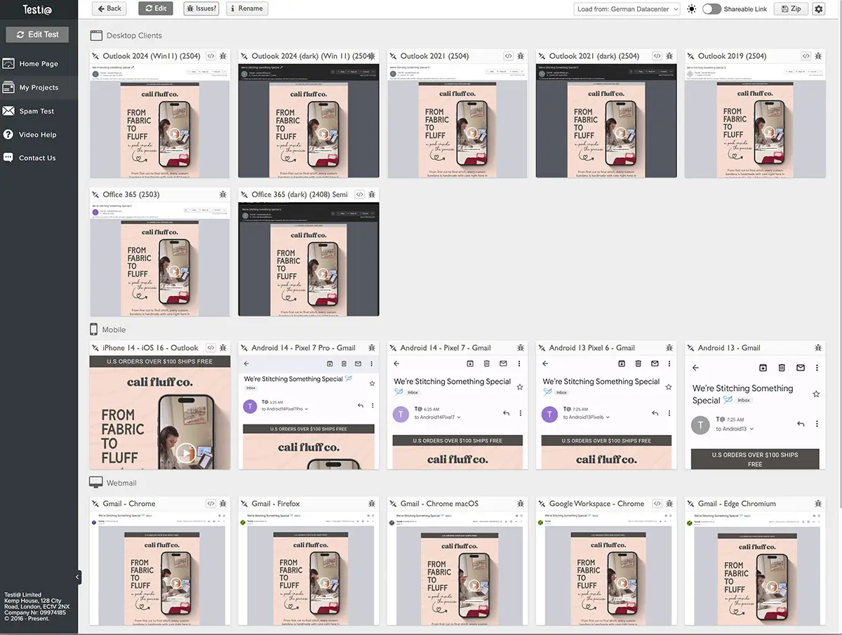
Professional designers test across multiple email clients because they know Outlook renders emails differently than Apple Mail or Gmail. They design with these limitations in mind rather than hoping for the best. This isn't paranoia, it's professional competence.
Load Time Optimization
Email load time plays a major role in whether someone engages or clicks away. Large, unoptimized images, heavy GIFs, and excessive code can slow delivery and frustrate readers. Optimizing file sizes, using modern compression methods, and testing performance across devices and connection speeds can significantly improve engagement rates. Even a delay of just a few seconds can cause subscribers to abandon the email before it’s fully loaded, costing valuable opens, clicks, and sales.
Deliverability Factors
Poor design choices can trigger spam filters. Skilled designers know how to structure emails, optimize images, and use formatting best practices that help messages reach the inbox instead of the spam folder. This technical expertise is invisible to recipients but essential for strong performance.
Industry-Specific Considerations
Professional Email Design for E-commerce
E-commerce emails require a level of precision that generic templates cannot deliver. Product photography should highlight items in a way that draws attention without cluttering the layout. Pricing should build urgency while still feeling on brand and trustworthy. Strategic cues such as limited time offers or low stock messaging can prompt quick action without sacrificing visual appeal.
With the high average order values and long term customer potential in e-commerce, quality design is an investment. When a single campaign can bring in thousands in revenue, design becomes a direct driver of your bottom line.
Seasonal Campaign Adaptability
Professional designers create design systems that can be quickly adapted for holiday campaigns with seasonal colors and imagery, sales events with urgency-driven design elements, product launches with excitement-building layouts, and win-back campaigns with value-focused messaging. All while maintaining brand consistency and recognition.
This systematic approach prevents the common problem of seasonal emails that look like they came from a completely different company.
Implementing Professional Email Design Standards
Start With Performance Auditing
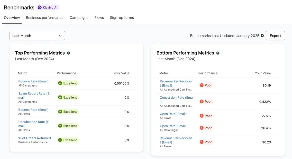
Use Klaviyo's benchmarking tools to understand how your current emails perform compared to your industry. Look for the biggest gaps in open rates, click rates, conversion rates, and mobile versus desktop performance. These gaps reveal where professional design can have the most immediate impact.
Priority Improvements
Focus on high-impact areas first:
- Mobile optimization should be your top priority if it isn't already handled properly
- CTA design and placement typically show immediate results
- Visual hierarchy improvements increase engagement across all metrics
- Brand consistency builds long-term recognition and trust
These improvements often have compound effects, where fixing one area improves performance in others.
Create Design Systems, Not Just Templates
Effective email design goes beyond creating a single good-looking message. It’s about developing scalable systems that work across every campaign type, keeping your branding consistent and performance strong. This method saves time and ensures every email aligns with your brand and conversion objectives.
Testing Calendar Approach
Test systematically rather than randomly. Focus on one element at a time over several weeks. Start with subject lines and preheader text, then move to CTA button colors and text, followed by image placement and sizing, and finally overall layout structures. This methodical approach reveals what actually drives performance improvements.
Professional Email Design Services: Investment vs Cost
While quality email design requires an investment, underperforming campaigns can be far more expensive. Since email marketing can generate $36–$42 for every dollar spent, improving design is a fast track to higher conversions and a stronger return.
Hidden Costs of DIY Design
The true cost of amateur email design includes:
- Time spent learning best practices through trial and error
- Fixing problems across different email clients
- Recreating templates for different campaigns
- Opportunity cost of lower conversion rates
- Revenue lost to poor mobile experience
- Brand damage from unprofessional appearance
These hidden costs often exceed the investment in professional design while delivering inferior results.
Professional Design ROI
Expert design creates layered improvements. Optimizing for mobile boosts opens, a clear visual hierarchy drives more clicks, and compelling CTAs lift conversions. Each improvement supports the next, creating measurable gains that quickly outweigh the cost of the investment.
The Bottom Line
High performing emails are the result of deliberate, data backed design choices that guide subscribers toward taking action while reinforcing a strong brand experience.
The brands achieving triple digit gains know email design is a science of conversion, not just decoration. They treat it as an investment, not a box to tick, because the right design can turn campaigns from mediocre performers into major revenue drivers.
With 59% of consumers saying marketing emails influence their purchases, design quality is not optional. Your emails will either drive profit or drain potential. The decision is yours.