If you’re selling on Amazon and spending money on ads, your Amazon Brand Storefront is working overtime, whether you realize it or not. It’s usually the first place shoppers land after clicking a Sponsored Brand ad, and it has one job to do fast: convince them to keep browsing instead of bouncing right back to search.
An effective Amazon Brand Storefront is not just a branded landing page. It’s the space where shoppers decide if your brand feels credible, organized, and worth their time. That decision happens quickly and often without much thought.
The problem is that many Brand Stores look fine on the surface. Clean banners, tidy product tiles, maybe a lifestyle image thrown in for good measure. But “looks fine” does not pay the bills. Conversion is a different skill entirely.
This post breaks down what actually drives sales inside an Amazon Brand Storefront, based on real shopper behavior and what consistently works for brands that treat their storefront like the sales tool it is, not just another box to check.
Why Amazon Brand Store Design Matters for Revenue
Most sellers treat their Amazon Brand Store as an afterthought. It’s often something they set up once for Brand Registry and then forget about, or sometimes never create one at all.
That's a mistake.
When someone clicks your Sponsored Brand ad, they land on your storefront. Not your product page. Your Amazon Brand Storefront becomes the gateway to everything else. If it doesn't immediately make sense or build confidence, they leave.
Amazon's own data shows that well-designed Brand Storefronts increase purchase consideration and drive higher average order values. But only when they're designed with strategy, not just thrown together.
What Makes Amazon Brand Store Design Convert
There are three layers that separate Amazon Brand Storefronts that convert from ones that don't: clarity, credibility, and flow.
Clarity in 3 Seconds
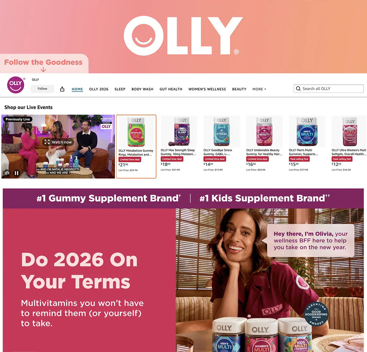
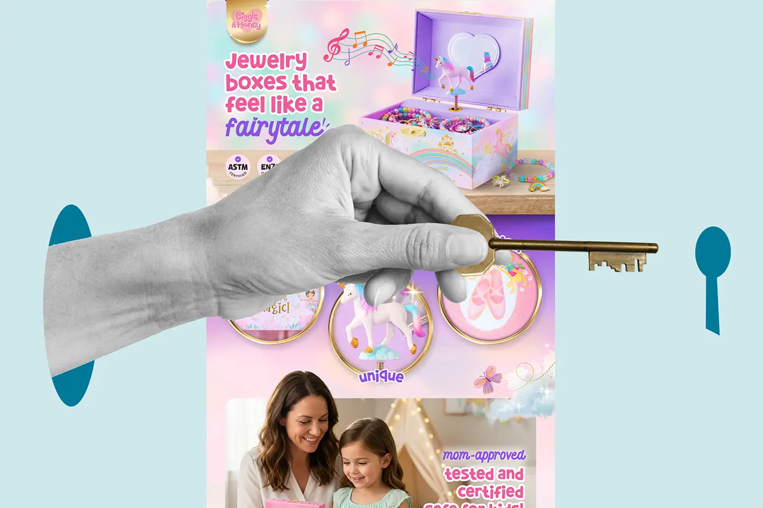
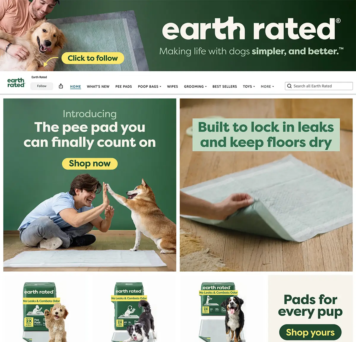
Your Amazon Brand Store homepage needs to orient shoppers immediately. Whether that's through your hero image, headline, or navigation structure, visitors should understand what you offer and where to find it within seconds.
Shoppers are moving fast. If they can't identify your product category or figure out where to go next, they're gone.
Think of your homepage like the entrance to a physical store. The goal isn't to force every element into the hero banner, but to create an immediate sense of direction.
Navigation should always prioritize products over brand storytelling. Shoppers visit your store to browse what you sell, not to learn your company history. Lead with your bestsellers and most important categories, then use deeper pages for brand narrative if needed.
One often-overlooked detail: make sure every product link goes to a live, in-stock ASIN. Broken links or out-of-stock products create friction and kill momentum. Audit your links quarterly at a minimum.
What works:
- Images that establish brand identity while giving context to what you sell (product-forward or lifestyle, depending on your category)
- One-sentence value proposition that states exactly what problem you solve
- Clear category labels in your navigation that match how people search
- Photos of your target audience using products (helps shoppers visualize themselves as buyers)
- Banners that balance visual appeal with functional clarity
- Navigation that uses specific product categories instead of vague exploratory labels
- Brand storytelling placed on deeper pages, not cluttering the homepage
Trust is everything on Amazon. Shoppers are choosing between you and dozens of competitors, many with similar pricing and Prime shipping.
Your Amazon Brand Store design needs to establish credibility fast. That means using visual and written cues that say "this brand knows what they're doing."
Consistency plays a huge role here. If your Amazon presence looks completely different from your website or social media, it raises questions. Shoppers compare across platforms while making purchase decisions, and a visual disconnect creates doubt.
Guiding Shoppers Toward Purchase
A lot of storefronts treat every page like a catalog. Just rows of products with no direction.
High-converting Amazon Brand Storefronts guide shoppers through a journey. They anticipate questions, address objections, and make the next step obvious.
The best stores balance brand storytelling with shoppable content. You need both, but knowing where each belongs makes the difference.
Video can play a major role here, but not all video placements are created equal. Auto-playing background videos capture attention without requiring a click, while standard video tiles require compelling cover images to drive engagement. Choose based on what you're trying to communicate. Background videos are well-suited to quickly showing products in use, while clickable videos are better for deeper storytelling or tutorials.
What works:
- A clear homepage that segments shoppers by need or category
- Subcategory pages that highlight bestsellers or featured collections
- Strategic product placement that guides shoppers to pages with strong A+ Content
- Visual hierarchy that naturally leads the eye down the page
- Mix of engaging content: video, lifestyle images, and product grids
- Dynamic widgets that automatically update when you add new products
- Shoppable images where customers can click on products they see in lifestyle scenes
Common Amazon Storefront Design Mistakes That Kill Conversions
Even well-designed Amazon Brand Store pages fall into predictable traps. Here are the ones I see most often.
Mistake 1: Inconsistent Visual Identity Across Touchpoints
Your Amazon brand should feel cohesive everywhere shoppers encounter it. If your Brand Storefront uses a sleek, minimal design, your A+ Content is cluttered with busy infographics, your listing images have a completely different style, and your website looks like it belongs to another company entirely, you're creating a visual disconnect.
Shoppers may not consciously notice the inconsistency, but it erodes their perception of your brand's professionalism and credibility. When every touchpoint feels like it belongs to the same brand, you build trust through consistency.
This doesn't mean everything needs to be identical. Your Brand Storefront, A+ Content, listing images, and external website can each serve different functions while still maintaining consistent color palettes, typography choices, image styles, and overall design language. The goal is to create a recognizable visual identity that carries across every platform where customers find you.
Mistake 2: Not Optimizing Your Amazon Storefront for Mobile
Over 70% of Amazon traffic comes from mobile devices. If your storefront looks great on desktop but cramped or broken on mobile, you're losing most of your audience.
This includes:
- Text in images that becomes unreadable on small screens
- Layouts that look cluttered or awkward when content stacks vertically
- Images that lose their impact or visual hierarchy on smaller displays
Mistake 3: Treating Every Product the Same in Your Amazon Brand Store
Not all products deserve equal real estate. Your bestsellers, highest-margin items, or newest launches should get priority placement and better visual treatment.
Use your Amazon Brand Store to highlight what matters most, not just display everything equally.
Mistake 4: Ignoring Your Advertising Strategy
If you're running Sponsored Brand ads in specific product categories, your Amazon Brand Storefront should align with them. Don't send traffic from a "Kitchen Essentials" ad to a homepage that requires three more clicks to find kitchen products.
Match your landing pages to your ad intent.
Mistake 5: Treating Your Amazon Brand Store as "Set It and Forget It"
Your Amazon Brand Storefront isn't a one-time project. It's a living marketing asset that should evolve with your catalog, seasons, and customer behavior.
Stores that never update feel stale. Regular refreshes signal to both shoppers and Amazon's algorithm that you're active and invested. This doesn't mean redesigning every month, but it does mean rotating featured products, updating seasonal promotions, and testing what works.
Use Store Insights to see which pages get the most traffic, where shoppers drop off, and what drives conversions. Then make changes based on actual data, not guesses.
Brands that test layouts, adjust featured products, and refine their approach over time consistently outperform those that launch once and move on.
Mistake 6: Weak Above-the-Fold Content
Most shoppers decide whether to explore your store or bounce within seconds of landing. What they see matters immediately.
If your homepage opens with nothing but a banner and requires scrolling before shoppers can see where to go or what you sell, you're losing them fast. The top of your page needs to give shoppers a clear starting point and a reason to keep browsing.
What works above the fold:
- Clear brand identifier (whether that's a hero image, logo, or simple brand mark)
- At least 2-3 shoppable product tiles or category links visible immediately
- Navigation that tells shoppers where to go next
- Minimal text that doesn't slow down product discovery
How Amazon Premium A+ Content Works With Your Brand Storefront
Premium A+ Content and your Amazon Brand Storefront should work together, not exist in isolation.
Your storefront provides the big-picture brand experience. Your Premium A+ modules handle the product-level details and objections.
When they're designed with the same visual language and messaging strategy, they reinforce each other. When they're disconnected, it creates confusion.
Think of the customer journey: Sponsored Brand ad leads to your Store, which builds trust and context, then guides shoppers to specific product pages where Premium A+ Content closes the sale. Each touchpoint should feel like part of the same brand experience.
Before driving traffic, make sure your product detail pages are ready. Check inventory levels, verify pricing is competitive, and confirm that your A+ Content loads correctly on both mobile and desktop.
What a Professional Amazon Store Design Looks Like
Here's what separates professional Amazon Brand Storefront design from template-based setups:
- Custom layouts built around your specific product categories and customer journey
- Cohesive Amazon product image design across all touchpoints
- Strategic use of white space and visual hierarchy
- Mobile-first design that works seamlessly across devices
- Integration with your Premium A+ Content and advertising strategy
- Data-driven optimization using Store Insights
- Clear calls to action throughout the store
Professional designs guide shoppers intentionally, test performance data, and refine over time.
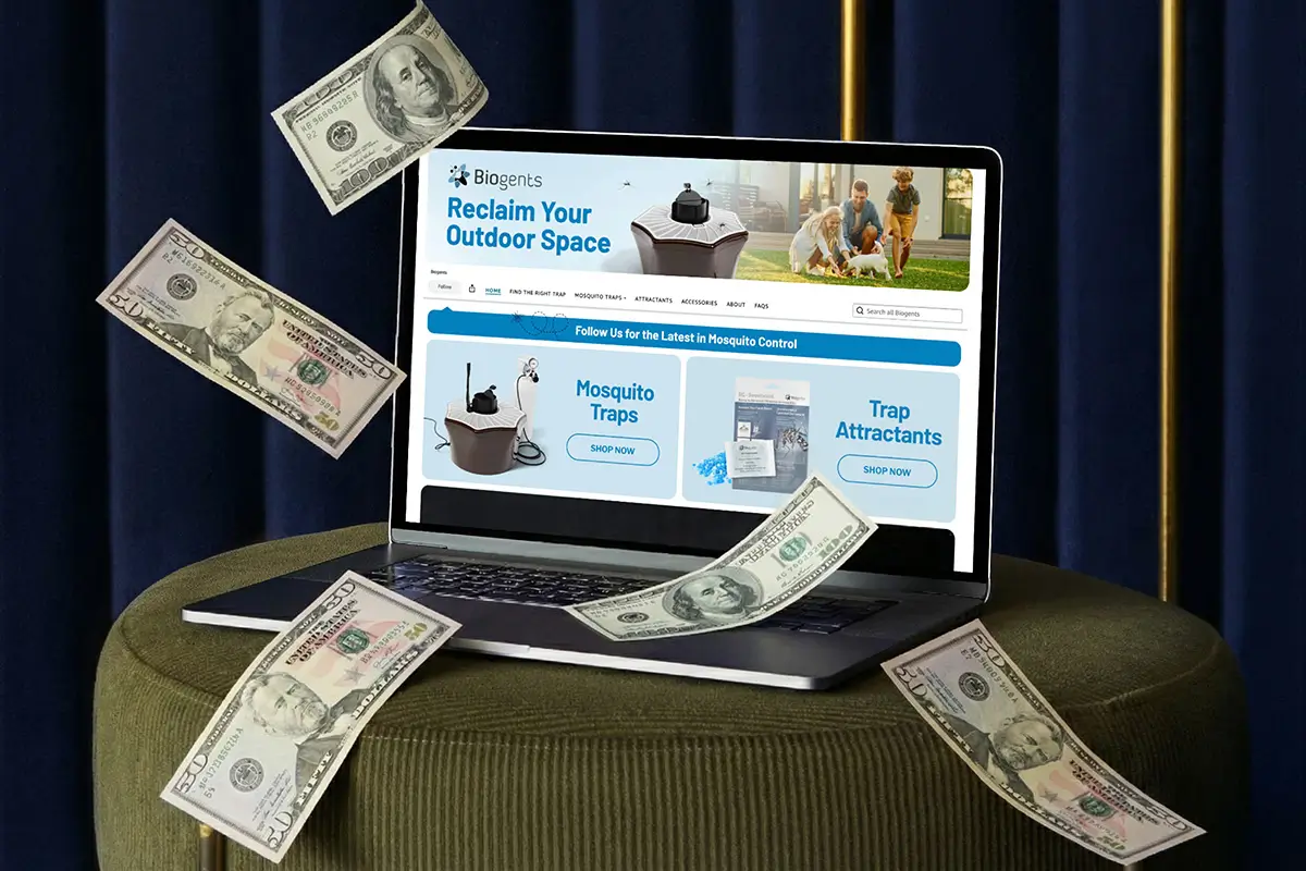
The ROI of Amazon Storefront Design
A well-designed Amazon Brand Storefront doesn't just look professional, it directly impacts your bottom line by improving how shoppers engage with your brand and products across multiple touchpoints.
Direct impact:
- Higher click-through rates from Sponsored Brand ads
- Lower bounce rates once shoppers land
- Increased time on site and pages viewed
- Higher average order values from better cross-selling
Indirect impact:
- Improved brand perception that carries over to product pages
- Better organic ranking from increased engagement signals
- Stronger defense against competitors trying to steal market share
- Foundation for future product launches
These metrics compound over time, meaning the investment in professional storefront design continues paying dividends long after the initial setup.
Driving Traffic to Your Amazon Storefront
A well-designed storefront means nothing if no one sees it. Your Amazon Brand Store doesn't automatically appear in search results, so you need a deliberate strategy to drive shoppers there.
On-Amazon promotion:
- Sponsored Brand ads that link directly to your storefront or specific category pages
- Link from your Brand Story product modules to your Brand Store
- Brand Storefront links automatically appear under the product title on your detail pages
- Feature your Store link in Amazon Posts
Off-Amazon promotion:
- Add your Store URL to social media bios and campaigns
- Include it in email marketing to existing customers
- Use it in influencer partnerships and affiliate programs
- Feature it in any external advertising that mentions Amazon
The more you actively drive qualified traffic to your Store, the better it performs. Don't wait for discovery, create it.
Optimizing Your Amazon Storefront
If you're redesigning your Amazon Brand Storefront or starting from scratch, prioritize in this order:
- Homepage clarity - Can first-time visitors understand what you sell in 3 seconds?
- Mobile experience - Does everything work perfectly on a phone?
- Image consistency - Do all your product images follow the same style and quality standards?
- Navigation structure - Can shoppers find what they need in 2 clicks or less?
- Integration with ads - Do your landing pages match your ad traffic intent?
- Keyword optimization - Are you using high-intent search terms naturally in your page titles and headlines?
Start there. Everything else can be refined over time.
Using Store Insights to Optimize Performance

One of the most underutilized features of Amazon Brand Storefronts is Store Insights. This free analytics tool shows you exactly how your store performs, which pages drive sales, and where shoppers drop off.
Key metrics to track:
- Daily visitors and page views
- Sales attributed to your store
- Traffic sources (organic, ads, external)
- Which pages convert best
- Where visitors exit your store
Use this data to make informed decisions, not guesses. If a particular category page gets high traffic but low conversion, test different layouts or featured products. If your homepage bounce rate is high, rework your hero image or simplify navigation.
Treat your Amazon Brand Storefront as a test-and-learn environment. Small changes backed by data compound over time into significant performance improvements.
Final Thoughts on Amazon Store Design
Your Amazon Brand Storefront isn’t just another page living quietly in your seller account. It’s often the first real impression shoppers get after clicking your ad, which means it has about five seconds to prove it belongs there.
Looking good is not enough. Your storefront needs to explain what you sell, build trust quickly, and guide shoppers toward a purchase without making them think too hard. When it does that, your ad spend stretches further, conversion rates improve, and your brand starts pulling its weight.
If your Amazon Brand Store isn’t converting as you'd like, it’s worth fixing the foundation before investing more in ads. Sending better traffic to a broken experience just makes your budget disappear faster.