


When Giggle & Honey first reached out, they were facing a challenge a lot of established Amazon sellers know well. They had built themselves into a category leader in children's jewelry boxes, but cheap overseas knockoffs had flooded the market. Competitors were undercutting them on price, and that was starting to erode their position.
The instinct in that situation is usually to lower your price or promote your way out of it. Giggle & Honey decided to take a different approach. They wanted to lean into being the premium option, and they needed the creative to back that up.
The Amazon Listing Images and A+ Redesign
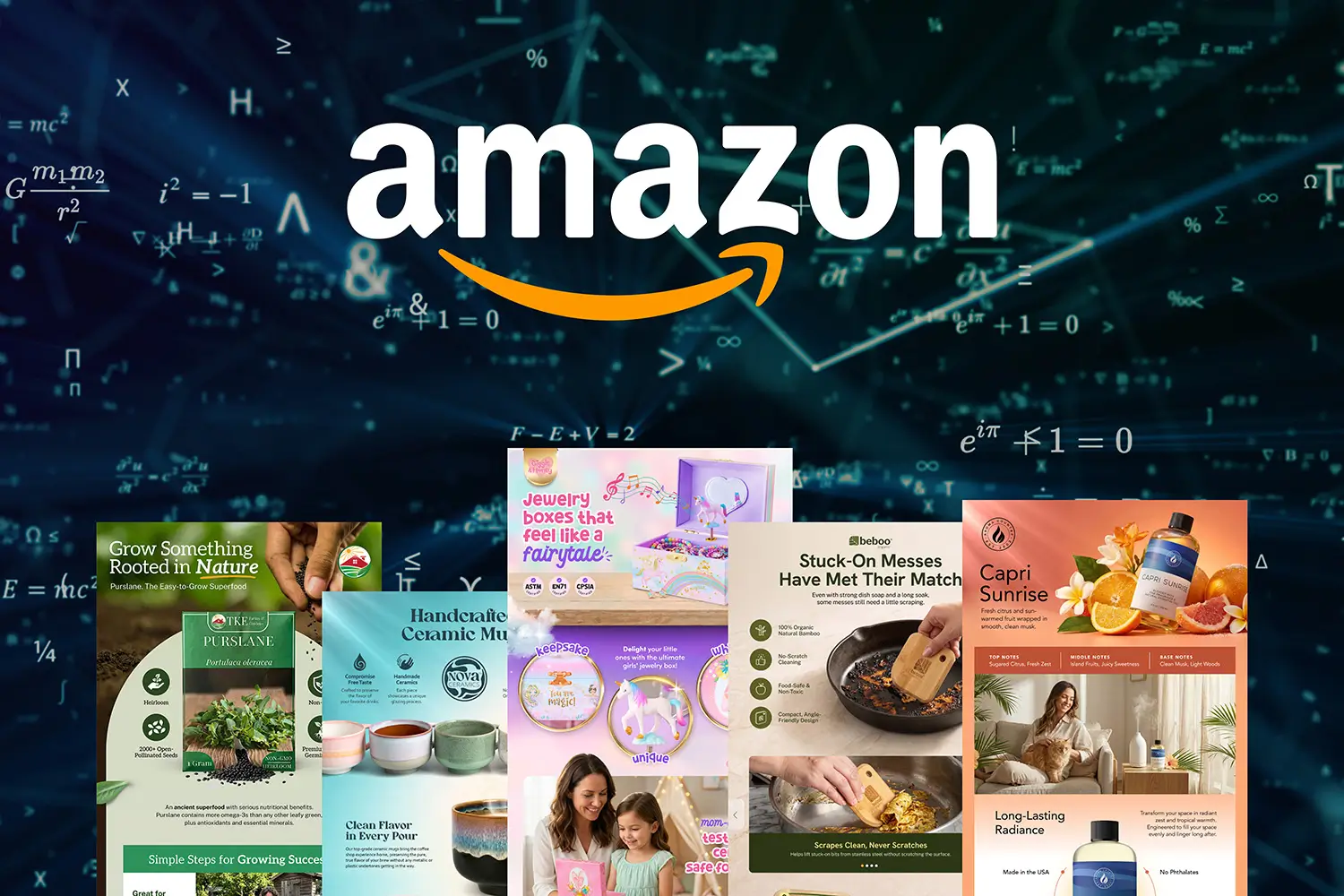
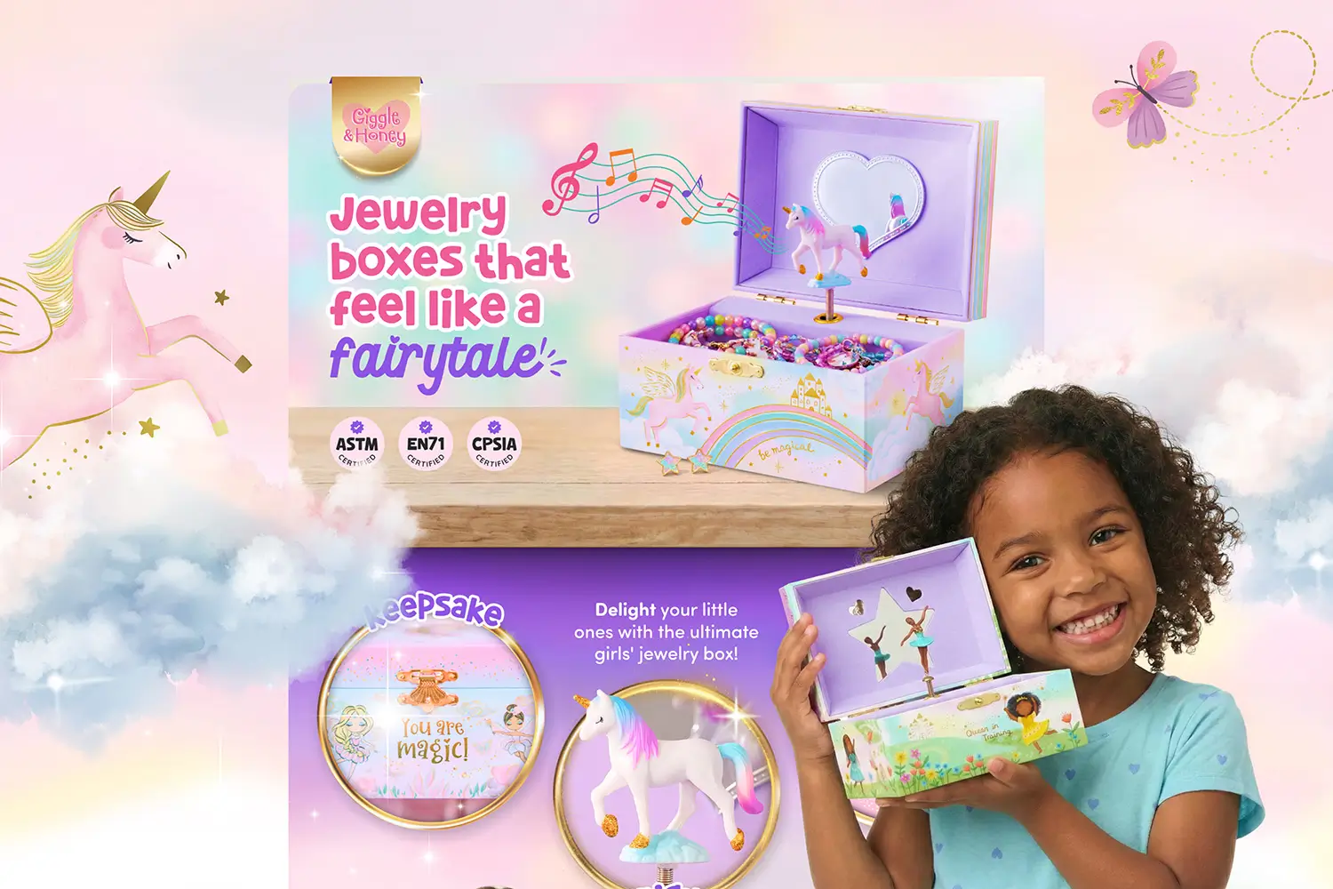
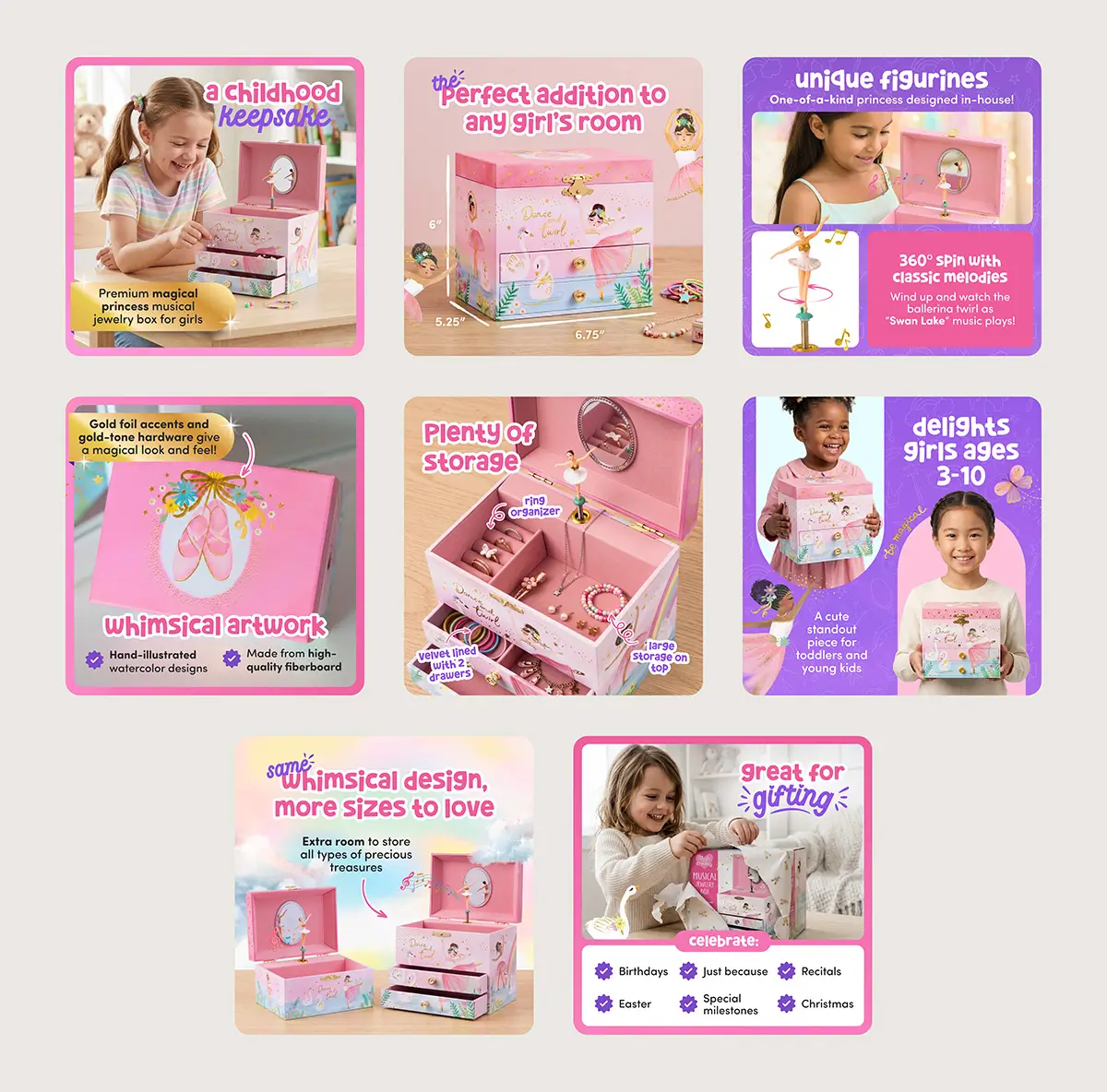
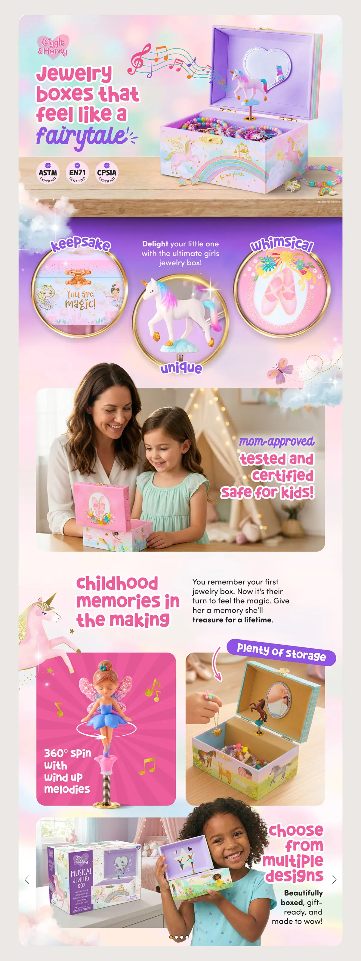
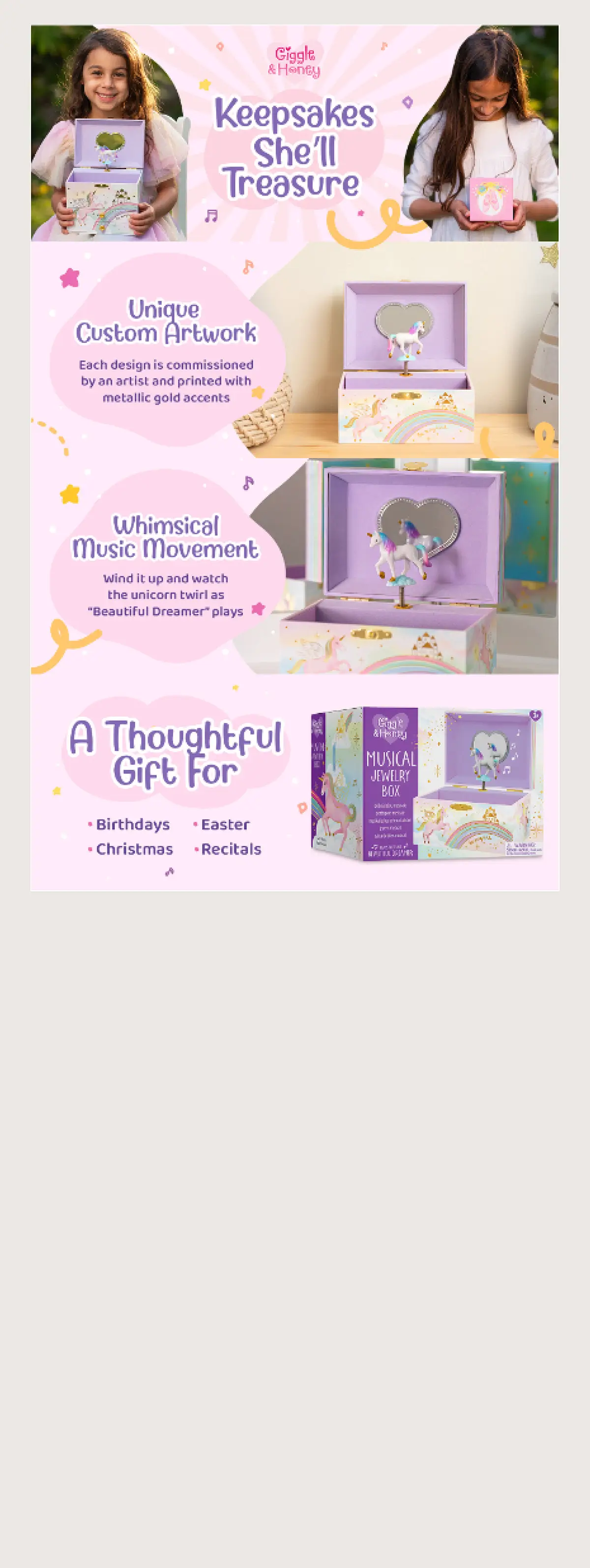
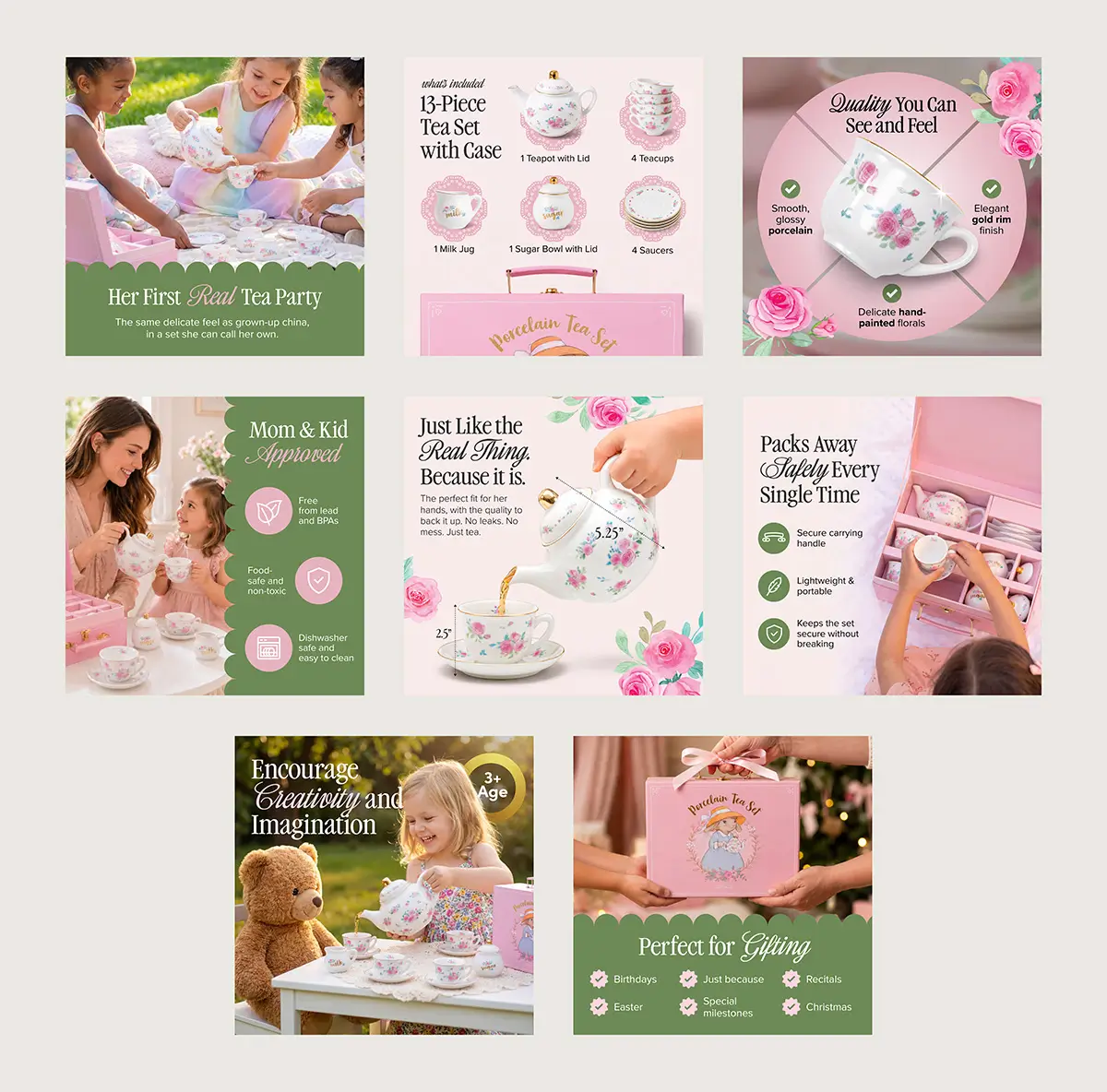
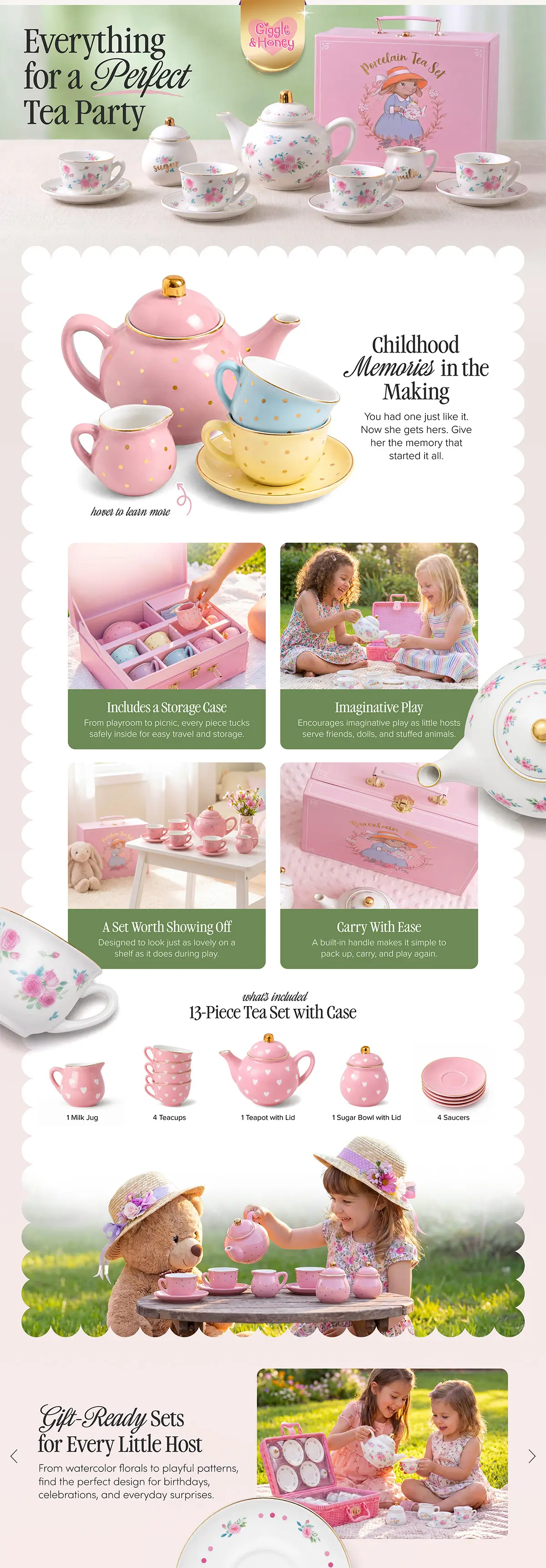
I came in to redesign the product listing images and Premium A+ Content for their best-selling small unicorn musical jewelry box, then expanded that work across several jewelry box sizes. After the success of the jewelry box redesign, they brought me back to do the same for their tea cup sets. For each ASIN, I created a new set of listing images. The Premium A+ Content was built out across all the theme variations to avoid creating an individual design for each variation since they had a few.
They already had some creative in place, including product images, a brand story, and an existing Premium A+ setup. But the A+ in particular was not where it needed to be. It was simple, flat, and it was not doing the job of justifying a premium price in a crowded category.
My Process Before a Single Design Goes Live
Before I open Figma, I do my homework. Every project starts with collecting assets from the client, then moving into competitive research. That means going directly into Amazon, browsing the relevant search results, and looking at the listings a shopper would actually see and compare. I want to know what the category looks and feels like from a buyer's perspective, and whether there is information competitors are leading with that the client is not.
I also use AI to speed up the research phase. It helps me quickly surface what customers in the category care about, what tends to drive them toward a purchase, and what creates hesitation or doubt. That gives me a much clearer picture of what information actually needs to be in the designs before I start making any layout or visual decisions.
Once the research is done, everything gets built in Figma first. All listing images, all A+ Content modules, every layout decision is fully designed and shared with the client for approval before anything touches Amazon. That review step keeps the process clean, avoids back and forth inside Seller Central, and gives the client a clear look at exactly what is going live. Only after sign-off do I export and upload into Amazon itself.
It is a more thorough process than a lot of sellers expect, but that is exactly why the results hold up.
How the Creative Strategy Came Together
These jewelry boxes are for young girls, but the buyer is mom, and that dual dynamic shaped every decision.
There was an added layer of complexity too. Instead of separate A+ Content for each theme variation, Giggle & Honey wanted one premium design that could showcase all their designs cohesively under a single parent product. The layout, imagery, and messaging all had to represent the full range while still feeling unified.
For the child, the listings needed to feel fun, colorful, and exciting. For the parent, they needed to feel trustworthy: safe materials, quality construction, a brand that looks polished and credible. One key piece of messaging was a "mom approved" angle, speaking directly to what a parent needs to feel confident about a gift purchase.
I sourced a custom font that fit the brand's personality and gave the typography a more intentional, polished feel across every module. The color approach was deliberate too, more vivid and expressive than competitors, without tipping into cheap or cartoonish.
Giggle & Honey had already moved toward AI-generated imagery before we started working together, so I worked within that framework to produce visuals that felt cohesive and premium throughout.
The thinking behind all of it was simple. When a listing looks more refined and trustworthy than everything else on the results page, price stops mattering as much. Perceived quality closes that gap faster than any discount.
A 5% Conversion Lift at a Higher Price Point
The numbers came directly from the Giggle & Honey team after the new designs went live.
Not only were they able to raise their retail prices after the redesign, but they held their position in a category actively being undercut by lower-priced competitors. And even at that higher price point, they saw a 5% increase in conversion and sales. That combination meant the win was not just in revenue. Their overall profitability increased as well.
To put that in context: 5% may not sound like a dramatic number on the surface. But when you factor in that it was achieved at a higher retail price, in a category being actively undercut by cheaper overseas sellers, it tells a very different story. Most brands in that position are either losing ground or cutting prices to hold their numbers. Giggle & Honey did neither. They charged more and converted better, and that combination is what pushed overall profitability up, not just top-line revenue.
"The new A+ content and listing images gave the products such a premium look that we were actually able to raise our retail prices. We haven't just seen an increase in top-line sales, but our overall profitability has shot up as well. It's been a win for us."
- Giggle & Honey Team
What Better Amazon Creative Actually Does for Your Brand
Price pressure from overseas sellers is a real challenge for a lot of Amazon brands right now. But lowering your price is not the only response available to you.
When your Amazon listing images and A+ Content clearly communicate quality, and when the visual experience of your listing builds trust faster than a competitor's does, shoppers will choose you even at a higher price. That is what strong Amazon creative is supposed to do. It does not just make a listing look better. It makes the buying decision easier.
The work with Giggle & Honey is still ongoing. I am currently in the process of designing an updated Amazon Brand Storefront for them, which is the next step in bringing the same premium, cohesive feel to every touchpoint a shopper encounters on their way to a purchase decision.
Want to work with an Amazon A+ content designer who leads with strategy, not templates? View my Amazon design services here.
Frequently Asked Questions
Can better Amazon A+ Content actually increase conversion rates?
Yes. In this case, a full redesign of the Premium A+ Content and listing images produced a 5% conversion lift for Giggle & Honey, even after the brand raised its retail prices. The design worked by building trust with the buyer (the parent) while making the product feel exciting to the end user (the child).
Does Amazon Premium A+ Content help with pricing power?
It can. When your listing looks more polished and credible than competitors, shoppers are more willing to pay a higher price. Giggle & Honey were able to raise their retail prices following the redesign and still saw an increase in both sales and overall profitability.
What is the difference between A+ Content and Premium A+ Content on Amazon?
Standard A+ Content gives brand-registered sellers access to enhanced modules including comparison charts, image and text combinations, and brand story sections. Premium A+ Content unlocks additional module types such as interactive hotspots, larger hero images, video, and more sophisticated layout options. Premium A+ is generally associated with higher conversion rates and a stronger premium brand impression.
What makes Amazon listing images convert better?
Listing images that convert well do two things at once: they communicate product quality clearly and they address the specific concerns of the buyer. For a children's gift product like a jewelry box, that means visuals that feel fun and colorful for the child, paired with trust signals like safe materials callouts and quality-forward design for the parent making the purchase decision.